Portante Capital Group
Strategy · Naming · BrandA name, a symbol and a brand system for a capital group.
“Everyone who has seen the brand Fred built for our new capital group has connected with it straight away. Not politely. Properly.”
Giuseppe Di Franco
Portante Capital Group needed a name, a symbol and a brand system its own people could keep using without me. The strategy came first and stays with the firm. Then the name, the symbol, the wordmark, the type and the colours, and last the files that carry all of it into the firm's own tools.
What the name means
Portante is Italian for load-bearing. The partners picked it from a shortlist of seven, each checked against the business register and the domain names first.
Six words to draw from
Before drawing, I turned each of the firm's six values into a single word the drawing could follow, and wrote down what each word asks of the design.
- Weight. The mark has weight, and colour carries it.
- Unadorned. No filigree and no ornament, in the mark or in how the brand speaks. Calm and respectable.
- Section. Built to communicate: hierarchy, categories and indexing, with colour, line, shape and texture doing the work.
- Build. Solidly built, stable and balanced, on a good foundation. Nothing that looks swift.
- Interlock. The parts visibly grip, and the space between them does structural work.
- Bond. The emphasis lands where the parts join, each part making a bigger whole.
Where the mark comes from
The firm's roots are Italian and Australian, and so are most of the sources. Each one shaped something in the drawing.
“To be heard, you must speak the language of the one you want to listen.”
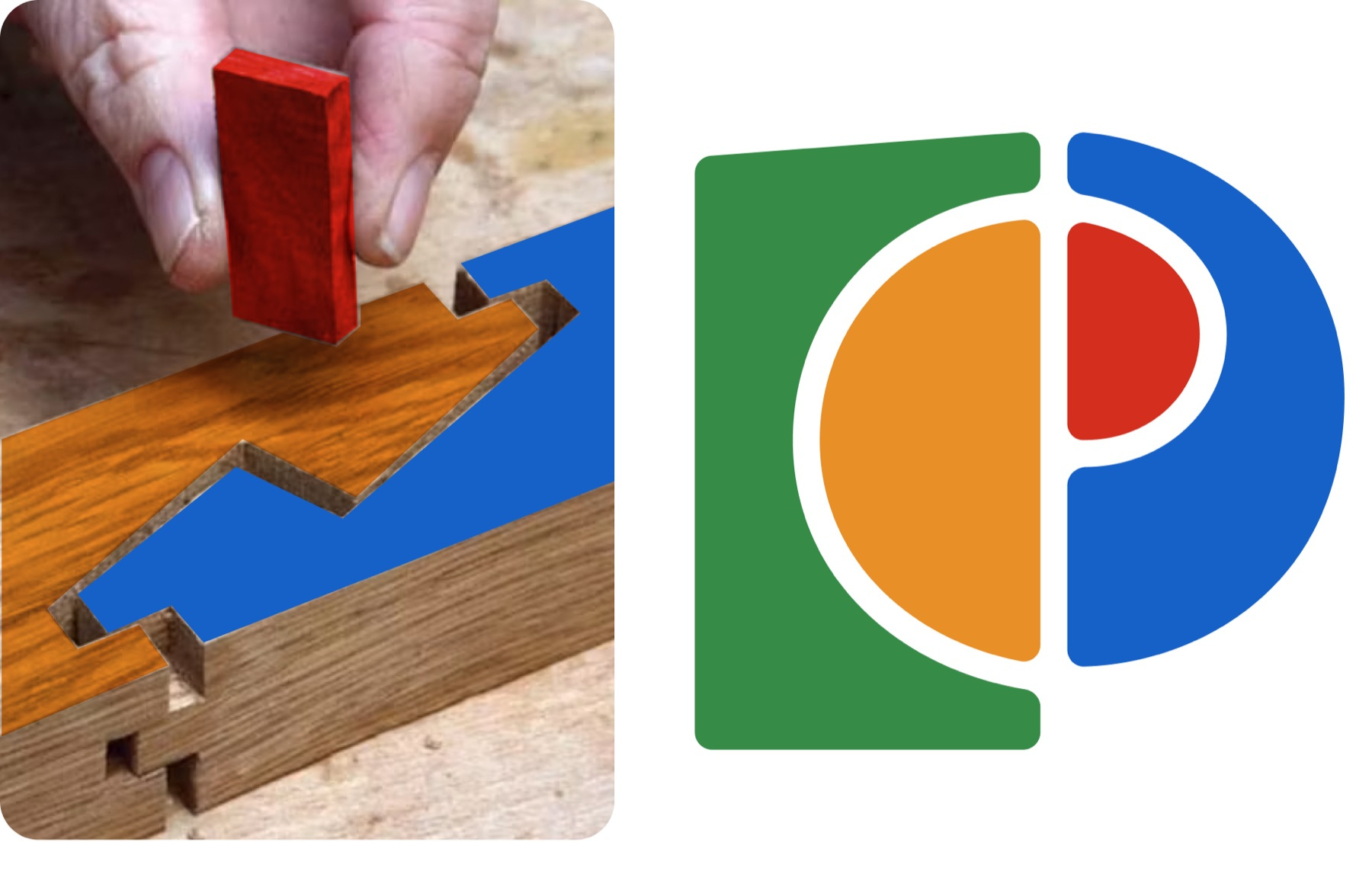
Kanawa tsugi, a Japanese carpenter's scarf joint, used in foundation footings. Two timbers lock end to end, and a pin driven through the centre holds them. It gave the mark its two halves and the seam down the middle. Portante is the key piece, the part that locks the two sides together.
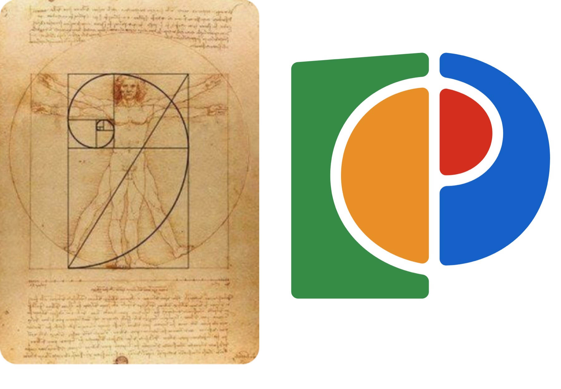
The golden ratio. The pale line between the two halves follows a spiral drawn to it, and that proportion sets its curve. The Italian mathematician Luca Pacioli called it the divine proportion, in a book he finished in Milan at the end of the fifteenth century, with drawings by Leonardo da Vinci.
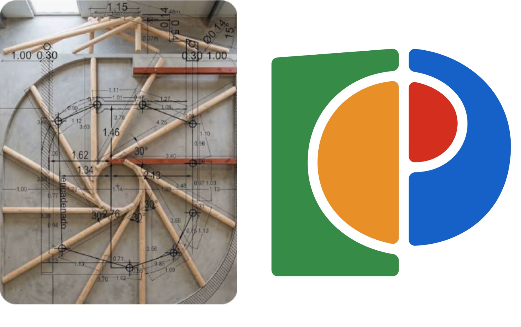
The reciprocal frame, a ring of beams in which each rests on the next, so the structure carries itself. Take one beam out and the whole can fall. Leonardo da Vinci sketched it for roofs and temporary bridges, and in the next century the Italian architect Sebastiano Serlio drew floors built the same way, spanning rooms wider than the timber was long. That geometry is where the mark's roundness comes from.
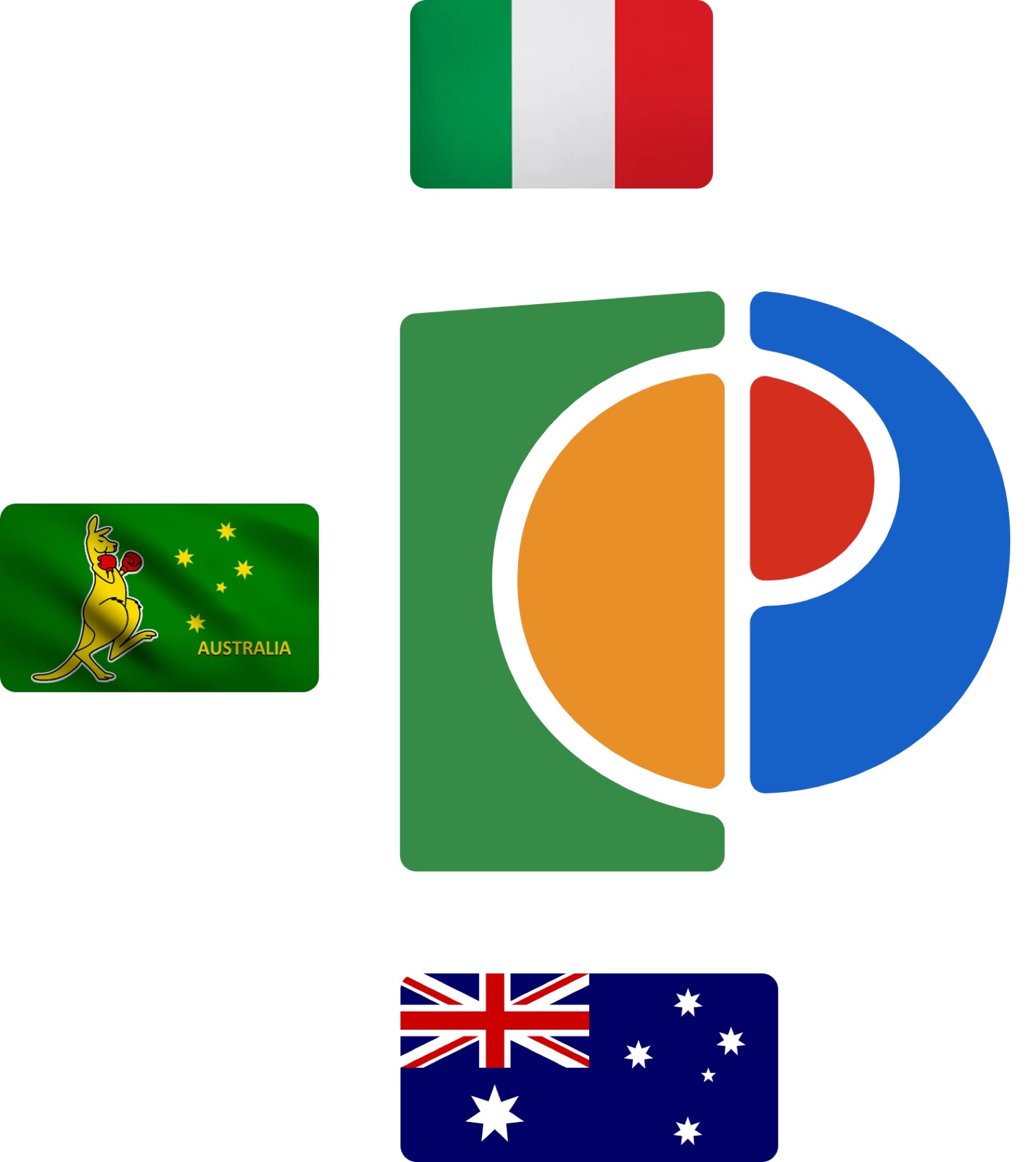
Two flags and a kangaroo: Italy's green, white and red, Australia's blue, white and red, and the green and gold of the boxing kangaroo, Australia's sporting flag. Every colour in the mark comes from one of the three.

The Italian design line of Massimo Vignelli, Albe Steiner and Aldo Novarese: flat colour, systematic construction, nothing rendered. I tried darker, more solid colours first and they sat too heavy, so the colours are bright.

Mid-century and postmodern buildings, with flat planes and strong horizontals and one curve against them, and the shells of the Sydney Opera House, which give the curve an Australian source beside the Italian one.
How the symbol is built
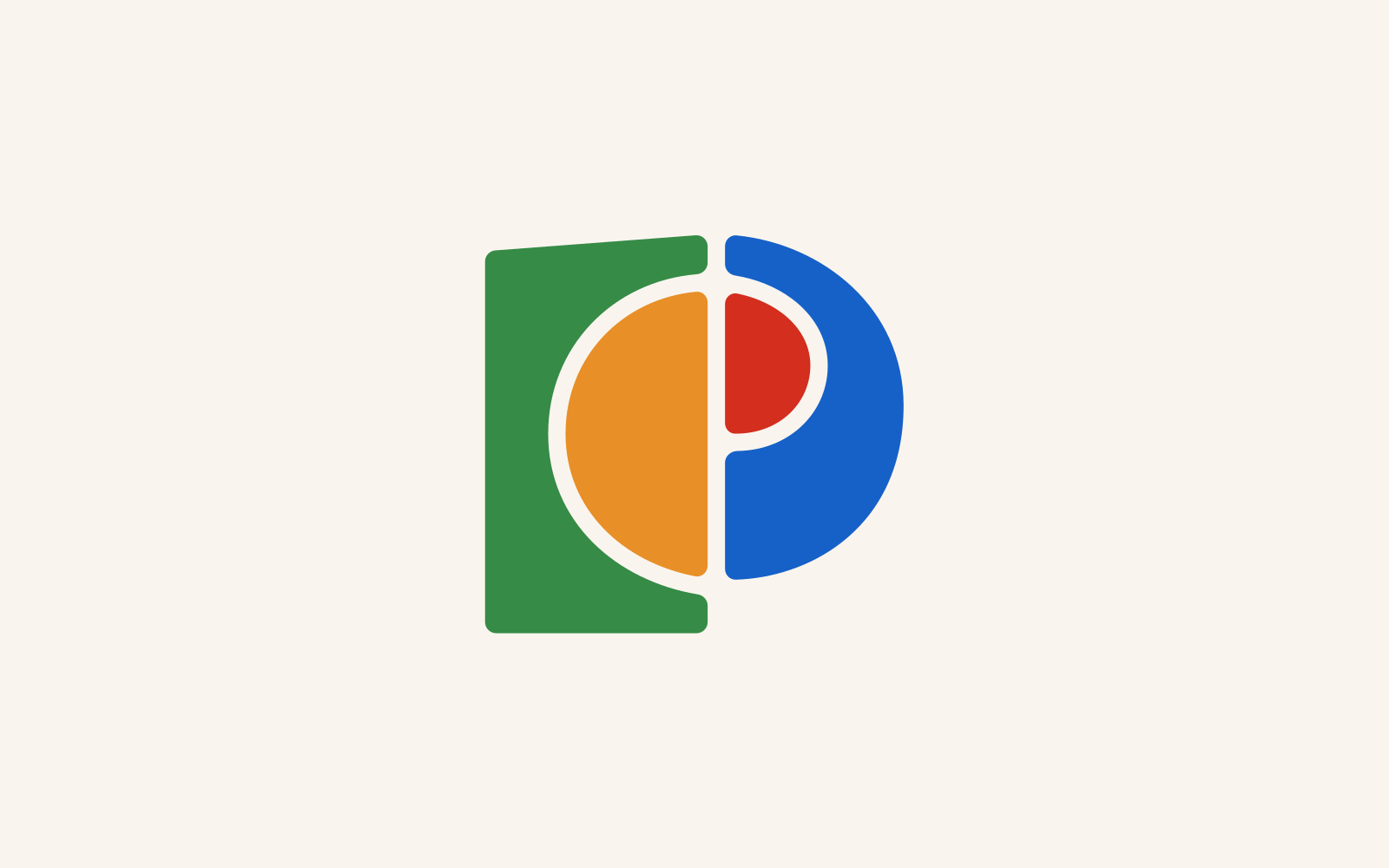
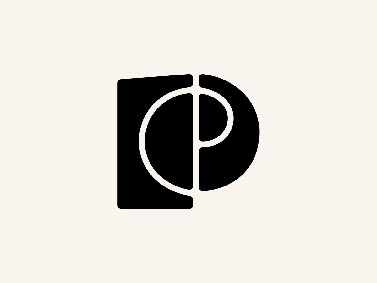
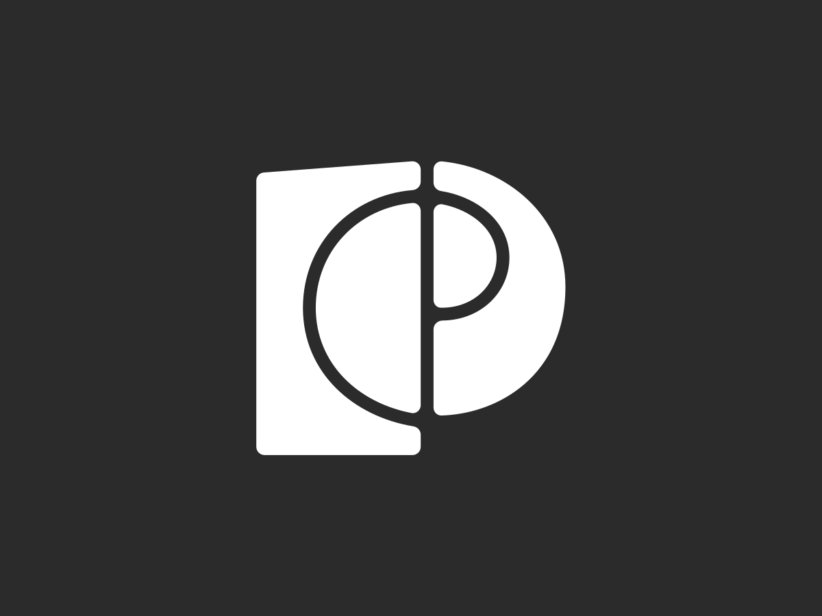
The mark is two P's locked together on one seam. The left half is squared and the right half is a bowl, and a pale line runs the full height between them, curving where the spiral takes it. Red, the smallest of the four colours, sits hard against that line inside the bowl. The mark is wider than it is tall, and its weight sits low. The top edge of the green lifts toward the centre at the pitch of a roof, the one place it refers to a building. Everything is solid except the line that moves.
“The details are not details”
Tested against the category
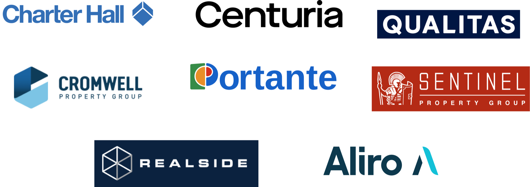
I mapped thirty firms in the category first, in four groups, and set Portante's lockup among each.
Competing for the same money
The platforms that set expectations
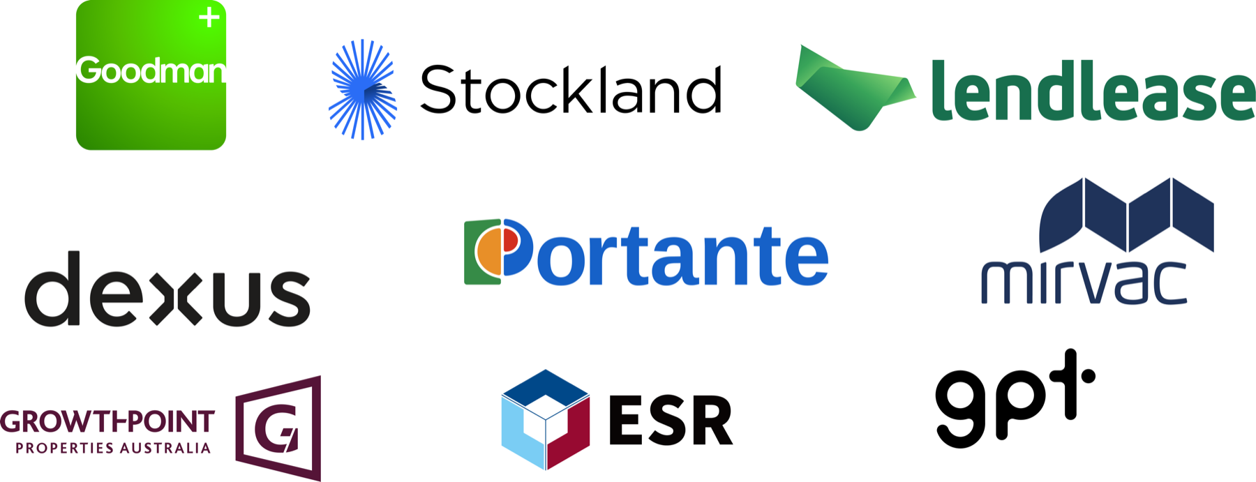
The ones closest in substance

Hong Kong capital, and the standard it sets
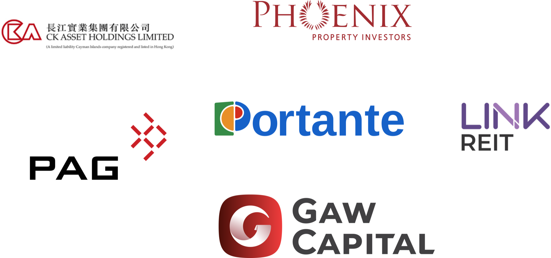
Nearly all of them use a wordmark with a small device at most, in blue or charcoal. Portante's symbol stands without its name beside it, in colours none of them use.
Wordmark and lockups
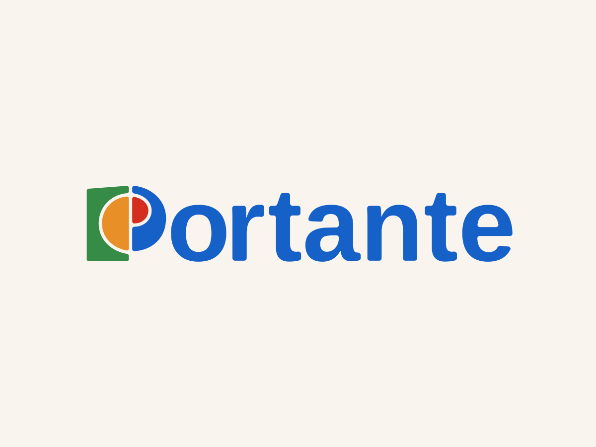
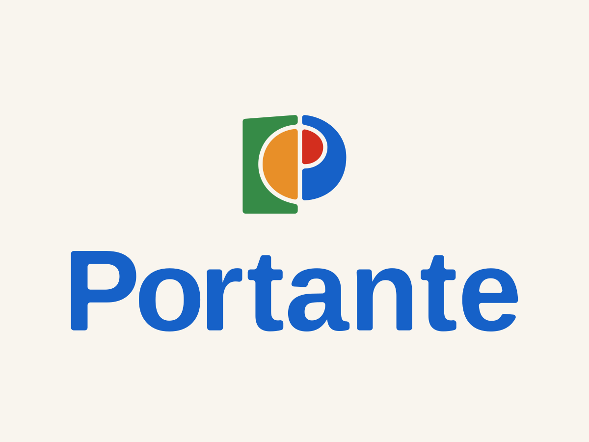
The wordmark is Arimo Bold with its corners rounded to match the symbol, and the rounding is the only change. In the horizontal lockup the symbol stands in for the P. The centred lockup is for covers and square formats.
Two typefaces
Arimo Bold appears once, drawn as the wordmark. Steve Matteson designed Arimo, and it is free to use anywhere under an open licence. Everything else is set in Noto Sans. The Noto family covers more than 1,000 languages and over 150 writing systems, and its name is short for "no tofu", the blank boxes a screen shows when a font has no character to show. It lets the brand take on a language the firm has not needed yet without changing its type.
Portante
ABCDEFGHIJKLMNOPQRSTUVWXYZ
abcdefghijklmnopqrstuvwxyz 1234567890
Portante Capital Group
ABCDEFGHIJKLMNOPQRSTUVWXYZ
abcdefghijklmnopqrstuvwxyz 1234567890
Seven colours
Paper and Travertine cover 85 per cent of any surface, Datum takes 10, and one of the three bright colours takes the last 5.
Colours that carry text
Every pairing was measured before it was allowed to carry words. Graphite on Paper measures 14.2 to 1, and white on Datum 5.9 to 1. White on Verde measures 4.3 to 1, under the 4.5 to 1 the web's accessibility guidelines set for body text, so it carries headings only. White on Sienna measures 2.5 to 1, under even the 3 to 1 set for large text, so Sienna always takes Graphite.
Handed over as files
The brand went to the firm as a brand file and design tokens: the voice, the words and every visual value, written so the firm's own tools, AI assistants included, load them before making anything. A page, a slide or an email template made later comes out in the brand.
What the client said
“I came to Fred with a vision and not much else: a few conversations about a new capital group and where I wanted it to be in five years. He took that, reverse-engineered it back to today, worked out how we get from here to there, and built a brand that fits every step of the way. Watching an idea I'd been carrying around in my head turn into something real was one of the most satisfying things I've done in years.
“What I love is the work underneath, because nothing in it is guesswork. He mapped thirty competitors and found the one position none of them occupied, then built the whole strategy around it. The naming ran three rounds and several hundred candidates. Every name was checked against the business register, the domains and even the slang dictionaries before it reached me, and every one that fell was written up with the reason. When a name we all liked died because nobody could say it out loud, he didn't just find another name. He fixed the process so it couldn't happen again. That's Fred all over.
“He lifted the real colours and typefaces off the competitors' own sites instead of describing them from memory. Where a figure couldn't be sourced he took it out rather than soften it. And then the identity: six values, each compressed to a single word, and from those a mark that stands on its own without the name beside it. There is meaning in every line of it, and I still get a lift every time I see it.
“That feel for the meaning behind things, and for how it all comes together into a modern brand you can take to market, is twenty years of experience at work, and you can't fake it. It took about a month of back and forth. Every gate cleared cleanly. No drama. Everyone who has seen the brand has connected with it and what it stands for. If you get the chance to work with Fred, take it. On anything like this, he's my first call.”
Want work like this for your business? I take it on by the month through Rational Magic.