Kotyra Gardenscapes
Strategy · Brand · WebsiteBrand strategy, identity, design system and website for a Melbourne gardening and landscaping business.
“Fred rebranded Kotyra and built our new website. Clear process, quick turnaround, very satisfied with the results. Highly recommend.”
Alfredo Anaduta, owner
When Alfredo Anaduta came to me, Kotyra had 165-plus clients, a script logo with a house, a leaf and a trowel, and nothing behind the logo: no colours, no typeface, no rules for where anything went. The business was moving from gardening towards landscaping, and the brand had to carry it there.
Brand strategy came first, then the symbol, the wordmark, the colours and the type, then the website, and last a handover written so his own tools could keep the brand consistent without me.


Who the client is
Alfredo spent more than 25 years in corporate operations before he started Kotyra. He left that life because gardening gave him something an office never had: a result he could see at the end of the day, and work he enjoyed. He founded Kotyra to bring the operations mindset to gardens: outdoor spaces that cost less time and money to keep.
“The most regretful people on earth are those who felt the call to creative work, who felt their own creative power restive and uprising, and gave to it neither power nor time.”

Strategy came first
Five values, each written as a full sentence and kept inside the business. Building meaningful connections. Optimism and action. Integrity and accountability. Fairness and appreciation. Confidence through quality. They give Alfredo a measure for every piece of copy, design and communication that comes after, so all of it lines up.
Then the thing the brand stands against. Kotyra's enemy is wasteful complexity: unnecessary costs, slow processes, and landscaping that is sold as flashy when the client needs it to work. Naming the enemy gave the brand its stance: simple and reliable, and never flashy.
Then the customer, written as three people. Olivia, an operations manager who is short on time and wants accountability. Steve, a small business owner who fears overpaying and wants honest guidance. Karen, a grounds manager juggling contractors who wants consistency with minimal oversight. Every one of them is a business.
Runs the day to day for a medium-sized business and looks after the outside contractors. Short on time, wants accountability, and needs quality and cost to balance.
Wears every hat and treats the grounds as a side concern. Fears overpaying, and wants honest guidance and a partner who makes the decision simple.
Keeps a large property looking right through several contractors. Wants consistency, reliable service, lower long-term costs and as little oversight as possible.
Naming the in-between
The old logo said Kotyra and nothing else. The business had grown up on gardening and was heading into landscaping, and no existing word covered the ground between the two. So I made one up. Gardenscapes went under the name on every lockup, and the business now uses gardenscaping as the word for what it does.
From values to shapes
The brief for the symbol was one line: a mark that can stand the test of time, memorable, uniquely Australian, and true to the values. To get from values to a symbol, I ran a ladder from abstract to concrete. Each value became a word, and each word became the things it brings to mind. The note from the working file reads:
- Community: hands
- Garden: leaf or grass
- Australian: colours
- Optimism: sun
- Integrity: shape
- Fairness: balance
- Confidence: bold
References before drawing
Before drawing anything I collected marks that each did one job well: badges that hold up on a cap and a shirt, sunrises, hands, hills, plants, and the way other green brands handle a website. From those I built stylescapes, strips of references that set a mood, and held each strip against the values until one felt like Kotyra: a badge, a sunrise over hills, warm colours on cream.
The obvious symbols for the category went on the list first so they could be ruled out: a leaf, a bush, a tree, plants. They all say small. Kotyra's plan was to grow into corporate landscaping and garden maintenance, and the people who buy that are looking for trust, reliability, a partner and a positive outlook. A leaf carries none of it. The mark had to keep the green and add warmth and hope: a sun for the outlook, and rolling hills of solid earth that read as a handshake, for the trust and for well-kept grounds. The competitor page confirmed it. The category had already used the leaf, the tree and the mower.

Drawing the symbol
Two pairs make the mark. A flower and a sunrise make the rays, for growth and optimism. Grassy hills and a handshake make the base, for partnership and hands-on work.
I drew it in outline first, three passes, before any colour went on. Then it went small, down to the size of a favicon, to prove it still read as a sun and two hands. Then the colours. The first trial had plain yellow rays over a dark green base. The version I presented had Wattle Gold rays, a Sunset Rust sun and Gumleaf Green hills, on a disc of Coastal Sand.


Choosing the wordmark
Kotyra is an invented name, so the wordmark had one job: be read correctly the first time. I set the name about thirty times beside the symbol, in different typefaces and weights, in capitals and in title case, and cut the list down to the ones that stayed clear at small sizes. Sofia Sans Bold won. Clean, plain, and confident in capitals. The orange is the same Sunset Rust as the sun.
Seven colours named for the country
The first colour note had four lines. Greens for long-term partnership. A sun-burnt yellow for optimism and action. A beach-sand white for simplicity and fairness. A red-earth brown for integrity and confidence.
The final palette kept that logic and named each colour for the country: Bushland Green, Gumleaf Green, Coastal Sand, Outback Ochre, Sunset Rust, Wattle Gold and Desert Glow. Four of them made the colour version of the logo. A 60/30/10 rule tells anyone laying out a page how much of each to use: sixty per cent light colours, thirty dark, ten accent. A rule that plain is what lets the owner, or a machine, make a page that still looks like the brand.
Type for everything else
Sofia Sans Bold for the wordmark, titles and headers. Merriweather Regular for body copy. Both are free on Google Fonts, so anything Alfredo makes later costs nothing to set correctly.
Greener spaces, smarter solutions.
ABCDEFGHIJKLMNOPQRSTUVWXYZ
abcdefghijklmnopqrstuvwxyz 1234567890
We're here to make your gardening and landscaping work for you, not just today, but for the long haul.
ABCDEFGHIJKLMNOPQRSTUVWXYZ
abcdefghijklmnopqrstuvwxyz 1234567890
Lockups and the one-colour set
Eight lockups cover every place the brand goes: a round badge with the year the business started, the stacked mark, the mark beside the wordmark, and the wordmark alone. Then a one-colour set for the places colour cannot go: green, orange, gold and black, in outline and in solid, and reversed out of a photograph.


Tested against the competition
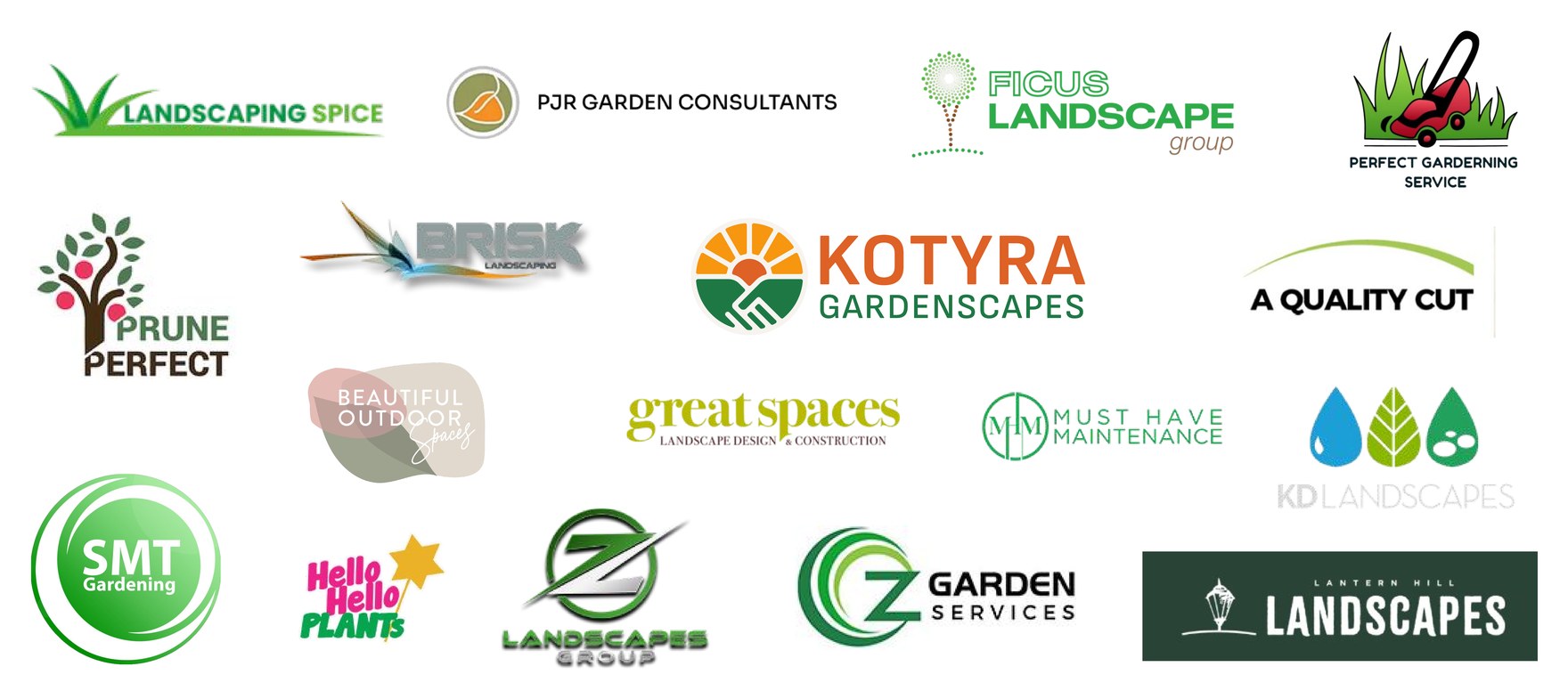
Before the deck went to Alfredo, the mark was set unnamed among sixteen competitors' logos, most of them green and leafy. Ten people were shown the page and asked to pick one. Seven picked Kotyra.
What Alfredo asked for
Alfredo loved the concept. Then he saw the colours and asked for something more serious: one green instead of four colours, the hands, hills and rays in a dark green, the sun in a lighter green, and the wordmark the same way, Kotyra dark, Gardenscapes lighter. That is the version he received, and the one on his website.
It is less eye-catching than the colour version, and people feel less when they see it. In my experience that matters less than it looks. What matters is whether the service matches what the brand implies, or goes past it. The quiet mark sets a modest expectation. The work he does then beats it.
“It derives its meaning and usefulness from the quality of that which it symbolizes. If a company is second rate, the logo will eventually be perceived as second rate.”

On the van, the shirt and the ute
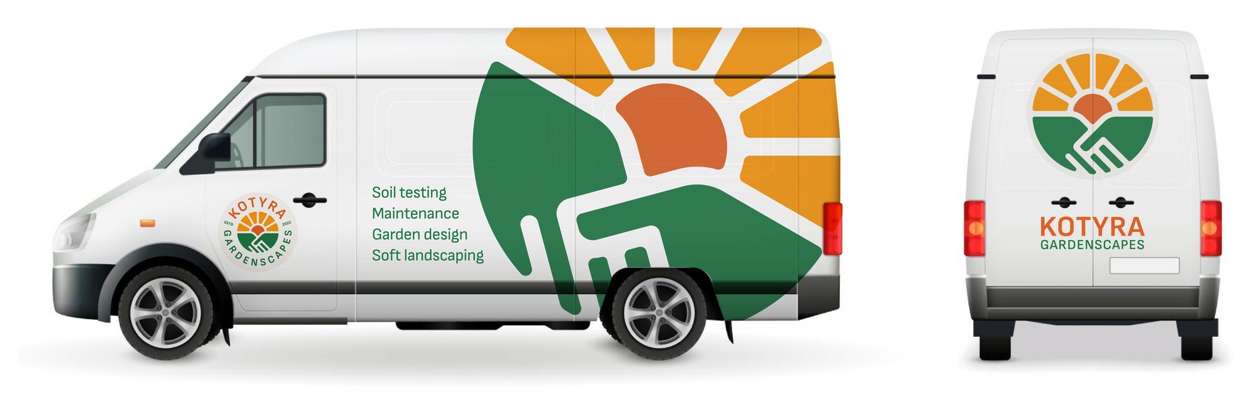
The system was drawn onto the things a customer actually sees: the van, with the mark cropped large across the side, the badge on the door and four services listed; the polo, with the stacked lockup on the chest; the ute.


Building the website
Once the deck was signed off, I studied landing pages: where a testimonial does its work, how a page leads with the benefit, how it asks for one action.
It opens on a photo of his own work, a set of Merbau decking steps, and names the reader: "Hi, small to medium business owner!" Fifteen services are listed by name, from mowing to retaining walls. The four values are rewritten as promises the reader can hold Kotyra to: partnership, practicality, reliability, sustainability. Alfredo's own story is on the page, and there is a blog he can post to himself.

What Alfredo received at handover
At handover Alfredo received every lockup in SVG and PNG, the brand deck, and a set of guidelines written for his own AI tools, so that a post or a flyer made without me still looks like Kotyra.
Want work like this for your business? I take it on by the month through Rational Magic.